Graphic Design Tools for Backend Engineers
You might think that being a backend engineer means you’ll never have to draw anything more complex than a bunch of boxes connected with arrows (or hexagons if are going all cloud native). This is simply not true, and that’s why you’re here.
At some point you’ll find yourself producing system diagrams, flow-charts, slides, mockups, maybe even icons! So, let me show you some tools and tricks I picked up over the years to fake it at design.
Hand-draw images
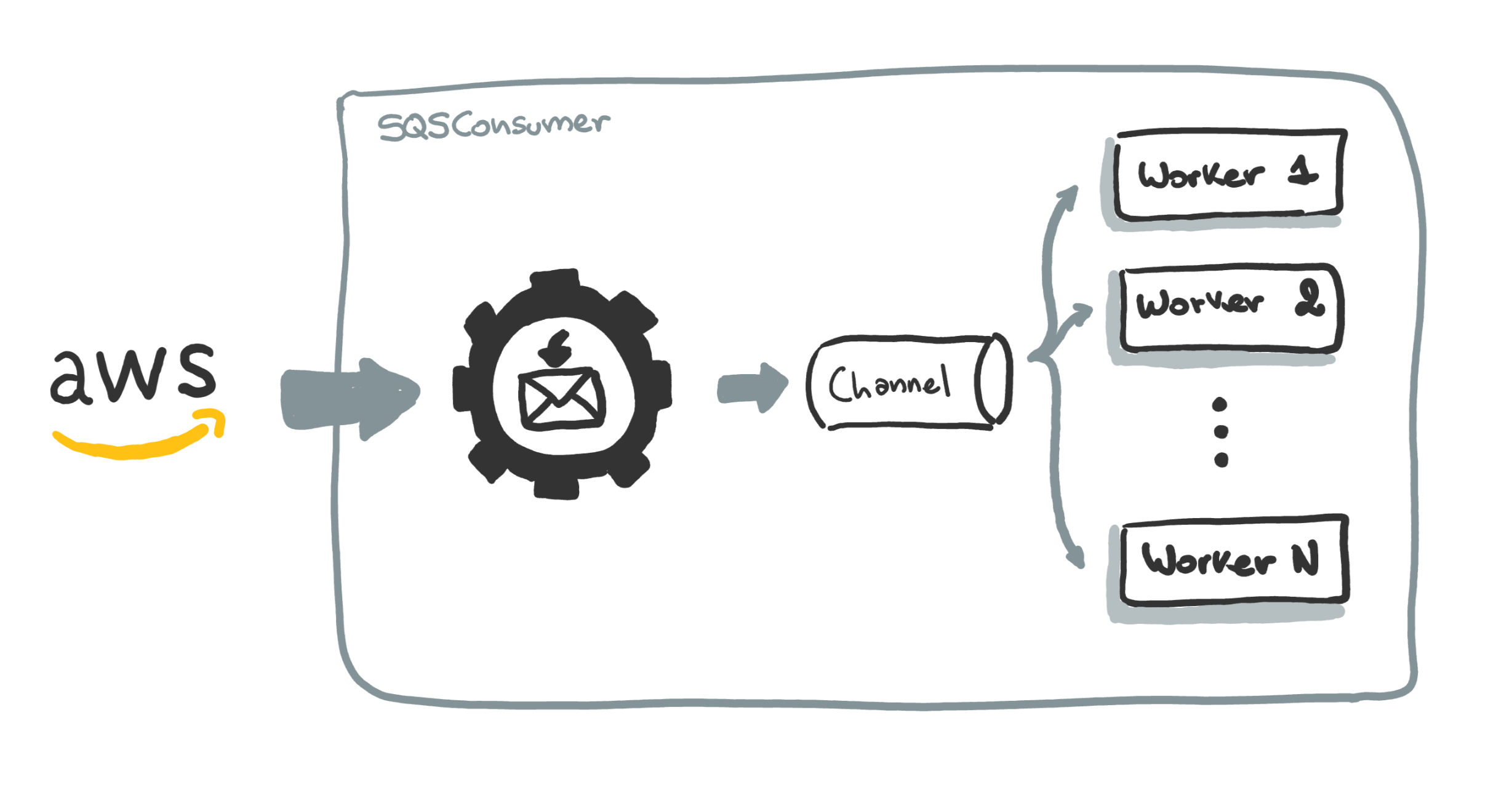
Maybe you noticed that some of the drawings that I use on this website look like they where done by a 5 year old. Like this one:
I create these using Microsoft’s OneNote on my wife’s Surface Pro. The app it’s somewhat basic, but it does one key thing: it lets you select your traces, move them around and scale them with simple gestures. And that’s really alI you need.
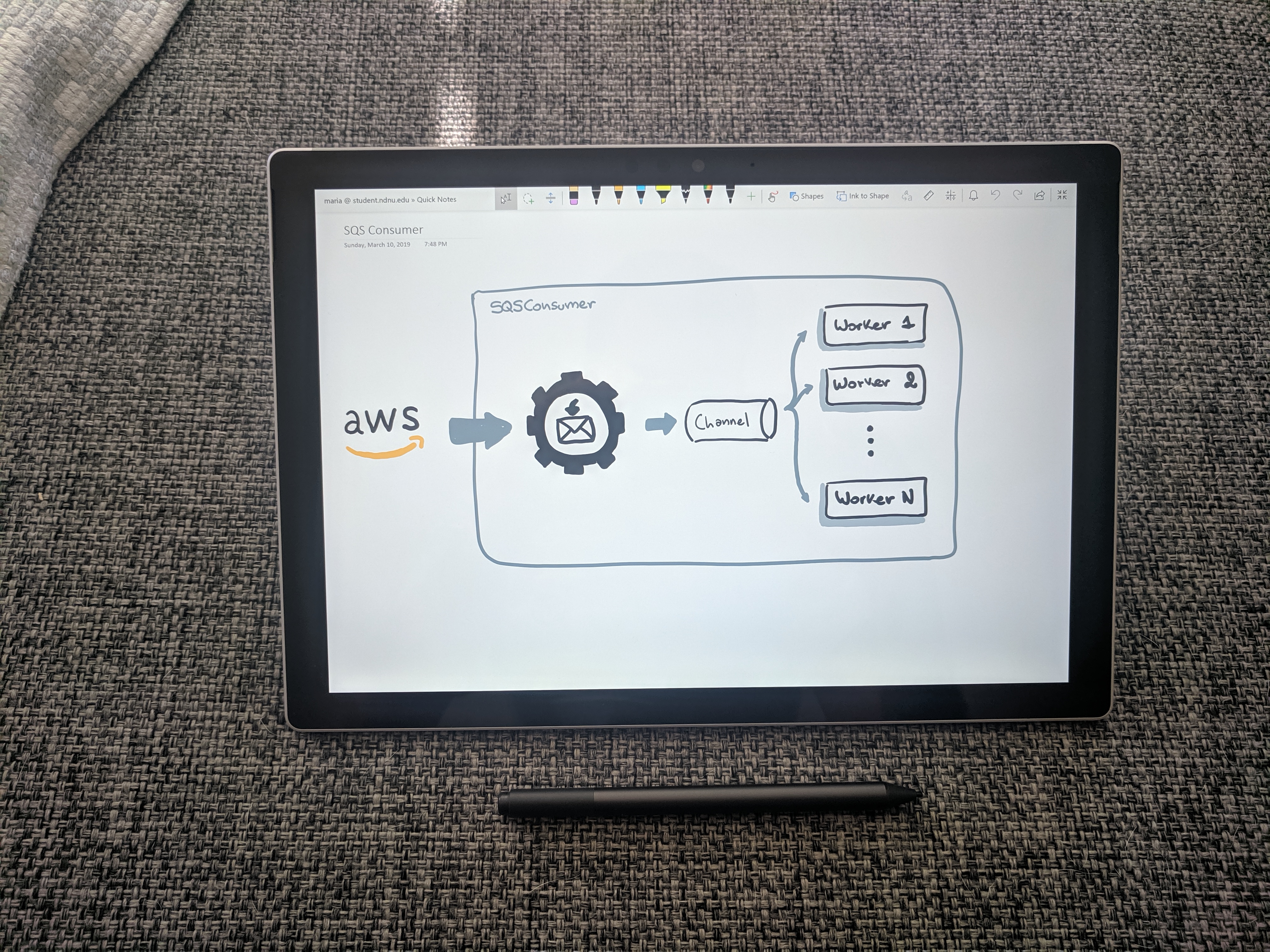
Also you can drop any kind of file to OneDrop and draw on top of it.

But, as I said, the Surface Pro is not mine, so I don’t get to take it to work. At the office I use a low-tech alternative: a Rocketbook. It’s a notebook you can erase with water.
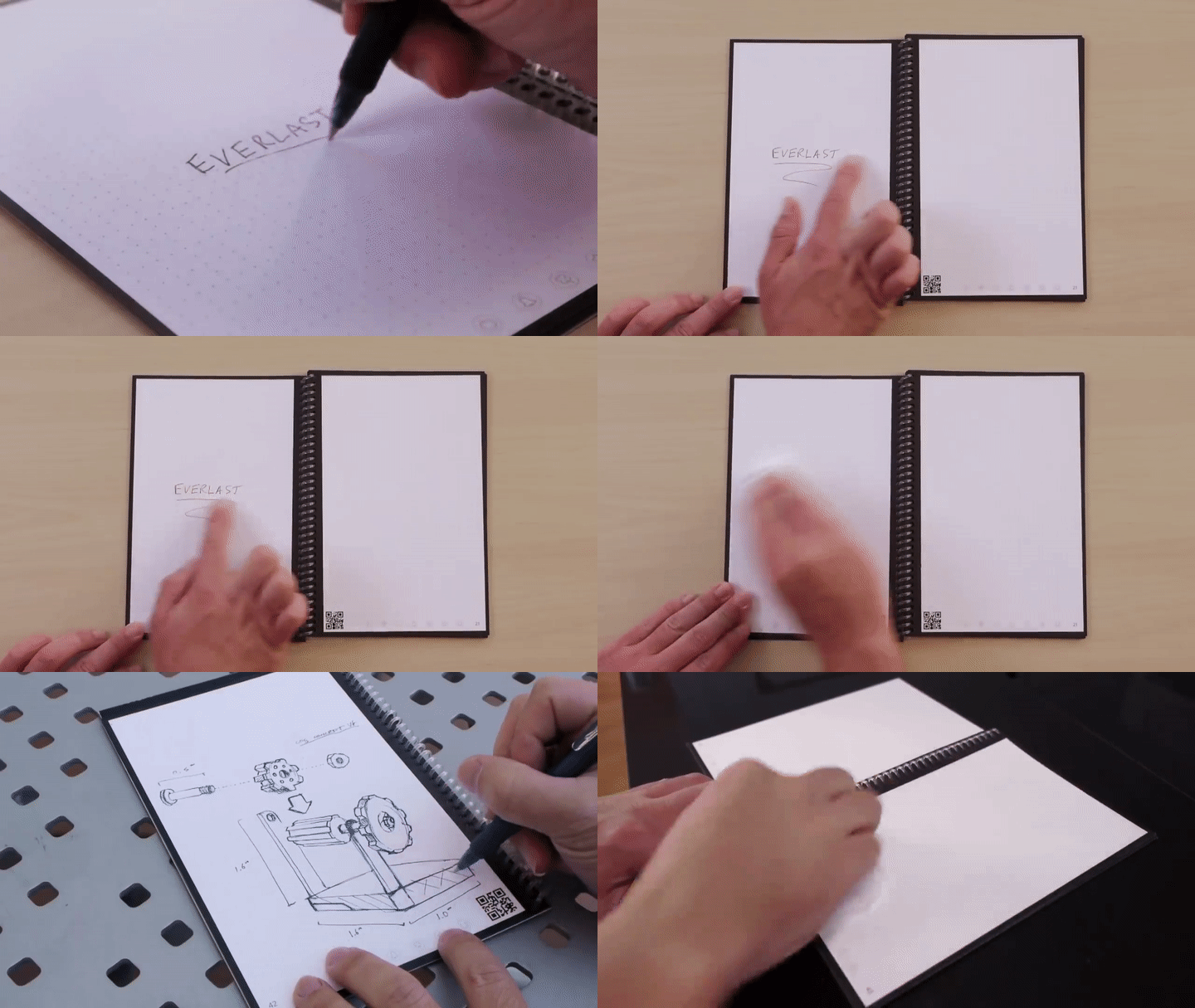
The pages are from a plasticky material, but it feels pretty close to drawing on actual paper. And you get karma points for not needing dead trees to do your half-ass doodles.
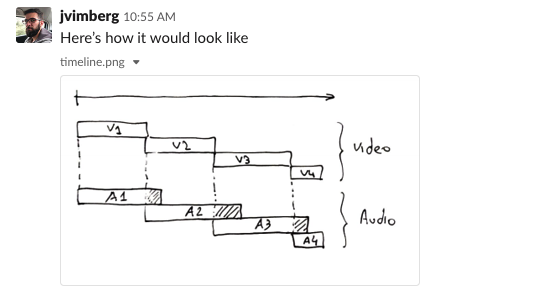
The best thing is that it comes with an app that allows you to scan your drawings and configure an action based on an icon you mark on the page. This helps me digitalize all my notes in a breeze. I can sketch something quickly, take out my phone and share it in Slack in 2 seconds, and without having to shell out $1k for an iPad.
My only complain is that you have to wait a couple of minutes for the pages to dry when you’re cleaning it. So cleaning the whole book might take you 15 or 20 minutes. But I only do this once a month so it’s not that big of a deal for me.
System diagrams and Flowcharts
Let’s face it, most of your diagrams will still be boxes, cylinders and stick-figures. You don’t want your wiki page or slides including an image like this:
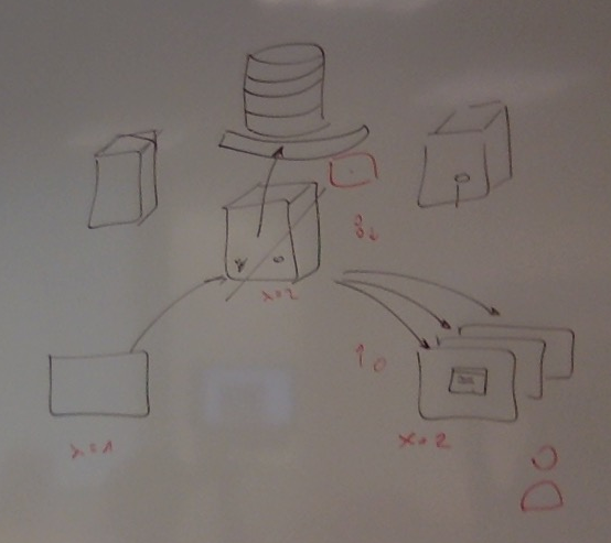
Why not do it with style? Meet Whimsical. With this tool you’ll be able to spit beautiful diagrams in seconds. It’s deceptively simple. It has smart snap to grip and auto-grouping that at times feels like it’s reading your mind.

It can do flowcharts, mind maps, wireframes and sticky notes. The catch is you only get 4 “boards” for free. After that it’s $10 a month💰
If you don’t feel like paying you can always use draw.io. It has Google Drive integration, and a wide variety of shapes for different types of diagrams (Flow-chars, UML, BPMN, etc).
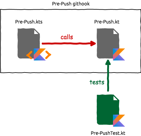
Use the comic style to get your diagrams to look like this:
(This diagram is from my “Writing Githooks in Kotlin” post)
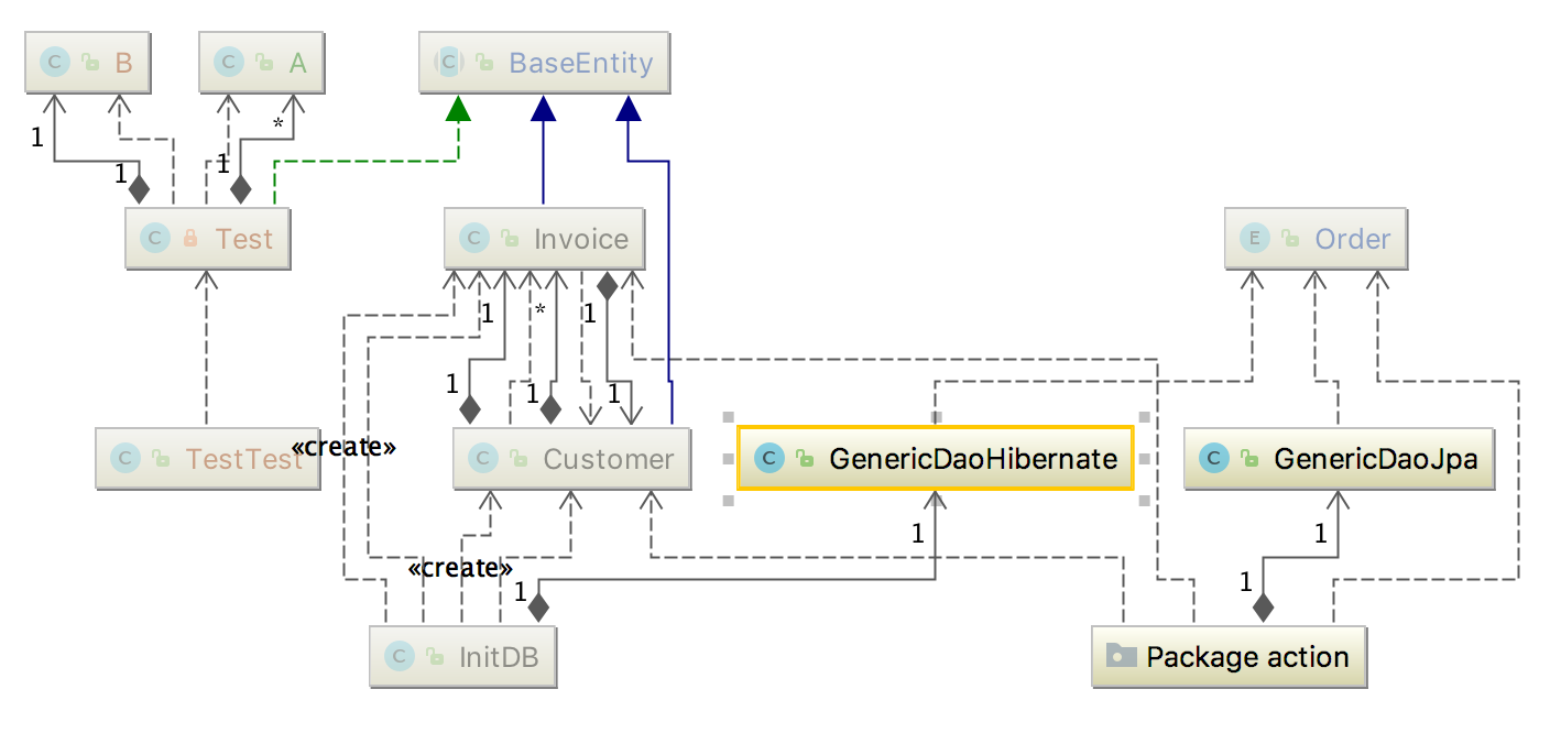
If all you’re trying to create is a UML of your existing code then you should check this Intellij feature that gives you just that in a couple clicks.
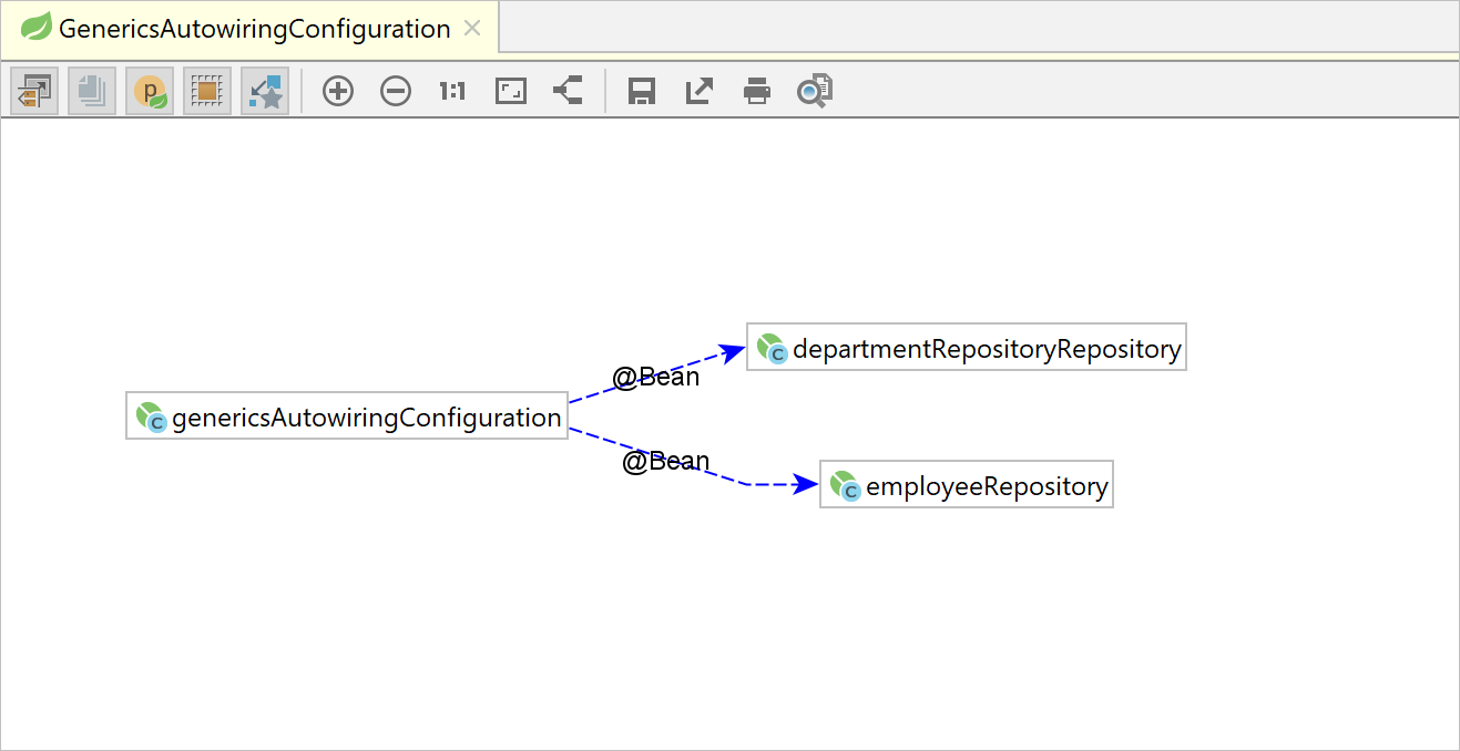
Similarly if you’re using Spring you can get a beans dependencies diagram just as easily.
Sharing snippets of code
If you need to share a snippet of code you can create a Gist like this one: sendForm.gs. And you can easily embed them in a page:
Gist are great because they have version history, can be commented, forked and starred and you can group multiple files in a single Gist.
If you happen to be working with Kotlin you can also use Kotlin Playground, this way you also get the ability to execute the code. Here is an example. You can also embed them as well, or better yet, include Kotlin playground as a script in your page and have all your code blocks converted to runnable snippets.
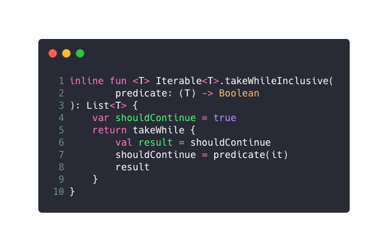
Finally, if all you want is to show some highlighted code you can use carbon.sh to get a beautiful image of your source code, like this one:
Presentations
I’ve used a lot of Prezis in the past. If you’ve never seen a Prezi think a giant canvas where you drop stuff, and each slide is basically zooming to a different portion of the canvas. Here’s an example of a Prezi I did about the things I learned from Coursera’s gamification course by Kevin Werbach.
It’s an awesome tool that adds a world of possibilities to your presentations. But, with time I understood that just throwing cool transitions doesn’t make your presentation that much better. As any good designer knows, animations need to serve a purpose. Prezi works best when you use its zooming effects to reinforce the ideas you’re trying to communicate, or to use the canvas layout so that viewers get a good sense on how the content is organized. If you combine this tools in a meaningful way you can create amazing presentations like this one.
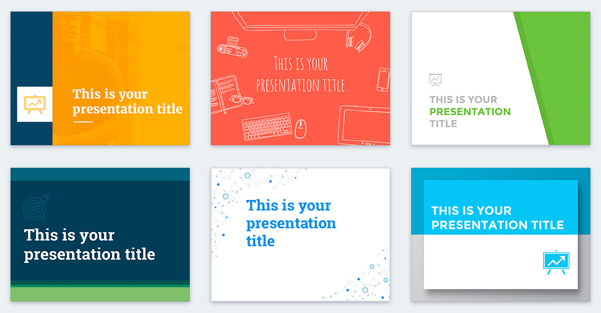
This days, though, if I need to throw a deck together quickly, I hit Slides Carnivals. I pick a template that matches the topic I’m covering, import it in Google Slides and start working on it. Only if I need some fancy animations I’d use Keynote (see next topic).
Finally, it doesn’t really matter which tools you use if you’re just going to cramp 3 paragraphs of text in a slide. And no, having bullet points doesn’t make it any better. You need to give your deck some ❤️. But that’s a topic for another day.
Animations
Animations can be super useful to visualize complex concepts. Specially on the backend world where much of our work consists of translating the mental model we have of the system into code. Creating visual cues, like animations, helps us communicate our intent in an unambiguous way.
Don’t believe me? Try explaining how the different kinds of Kotlin channels behave using just words. Then check this animation:
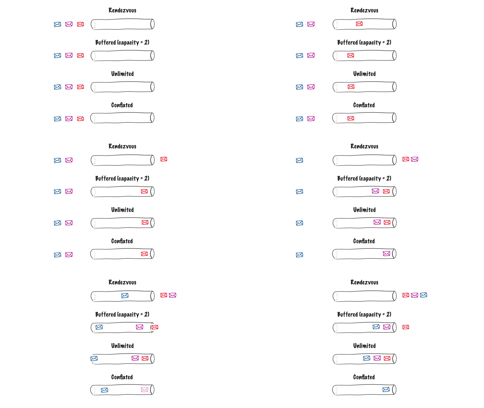
You can create simple animations like this one 👆 on Keynote. Using Magic move and playing around with the order you can create all kind of choreographed animations. When you’re satisfied with the result, you can export your creation as a gif and share it with the world.
UI Mocks
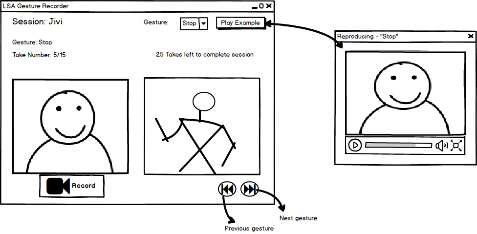
If you ever worked with non-tech people you know the importance of showing something. Just telling them about what a system will do or how it would look it’s not enough. They have to see it 👀. That’s why low-res mockups are so powerful. You can use a tool like Balsamiq to create something like this in minutes. And you can even make them interactive to show how different screens would connect to each other.
Whimsical also has wire-framing capabilities:
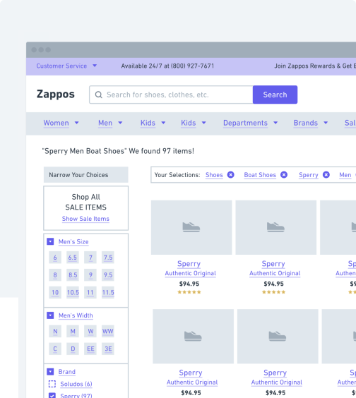
If you’re looking for something more high-res checkout InVision, that’s what all the cool kids are using this days.
Logos, banners and more
Canva is probably the best design tools for non-designers you’ll find online, hands down. I’ve used it for all kind of things. I’ve used it to create logos:
Presentations:
My resume:
Banners for an Android app I wrote:
And much, much more… Seriously, if you’ve never used it just go and check it out because it’s amazing, and super simple to use.
Icons
Check out the Icon generator, part of the Android Asset Studio tools put together by @Romanurik. Specially if you’re doing something on Android.
Bonus tips
Tip 1: Searching Google Images for some fancy image to drop into your diagram? Add filetype:png to your search to filter for PNG images. Also, make use the search tools to filter by color, size and license type!
Tip 2: ⌘ + Shift + 5. Screenshot everything. Screenshot your code in the IDE, screenshot multiple frames from a video and turn it into a gif, screenshot your drawings when the app you’re using doesn’t export to image (I’m looking at you OneNote). For example, for this post I wanted to create the photo border effect on my picture up there 👆. I knew Keynote had such effect but it’s not meant for image editing. So what did I do? I created a new slide with white background, drop my image, added the desired effect, ⌘ + Shift + 5 , and voila! I know it’s hacky, but it gets the work done!
Tip 3: Befriend graphic designers. Ask them what tools they use. Watch them work. Take note on how they dress.
