How to Craft Effective Presentations
This is a compilation of all the things I learned for creating effective presentations.
The golden rule: NO BULLET POINTS
If you can only take one thing from this article let it be this: DO NOT use bullet-points on your slides.
There’s a simple reason for this: Humans brains are really dumb. They can’t process spoken and written words at the same time. People will either read the slides or listen to you, but not both. And since you’re presenting my guess is you want them paying attention to you. So drop all that extra text so people can focus on what you’re saying.
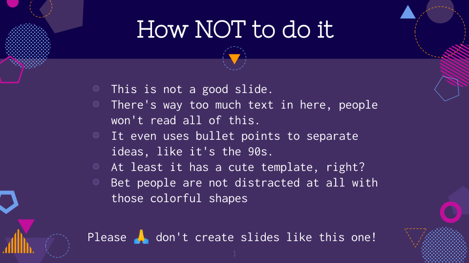
The first step to a bullet-free slide is breaking your content into smaller chunks. Each slide should focus on a single idea that can be expressed in one or two sentences (no more than 20 words). Less is more. The rest of the content, the things that you’d normally put in the bullet points, can be spoken. There’s no limit to the number of slides you can use, just make sure you’re only adding the key points on text and speaking the rest.
You’ll soon find out that doing this kind of breakdown is hard. Condensing each topic to a single line takes time. But I promise you, once you do this you’ll be halfway through to creating a great presentation.
Now that you have your central ideas, let’s talk about styling. The main goal is to keep it simple so viewers are not distracted. Choose a sans-serif typeface (the ones without the ornaments) and make your text HUGE.
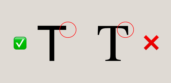
Big letters are important because everybody in the room should be able to read it, and it’ll help you stay under the 20 words limit. Pick contrasting colors for text and background. You can use Color Hunt to find a cool palette for your deck. Finally, place the text in the upper left corner. You can add an image or graph if needed, but don’t put something just because you have the space. Make sure it’s meaningful. Keep it short, keep it simple.
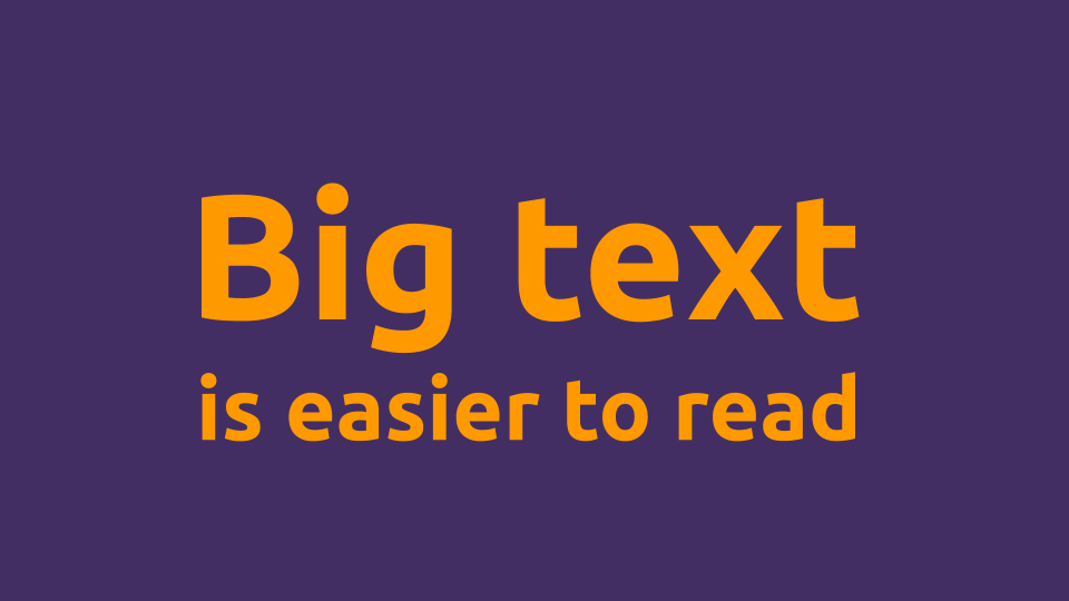
(Yes, this is the whole slide)
The handout
You might be worried that, by removing text from the slides, people won’t get the full context when going through your deck after the presentation. The solution is to create 2 different artifacts: a presentation and a handout.
All you have to do is move the text from the slides to the presenter notes.
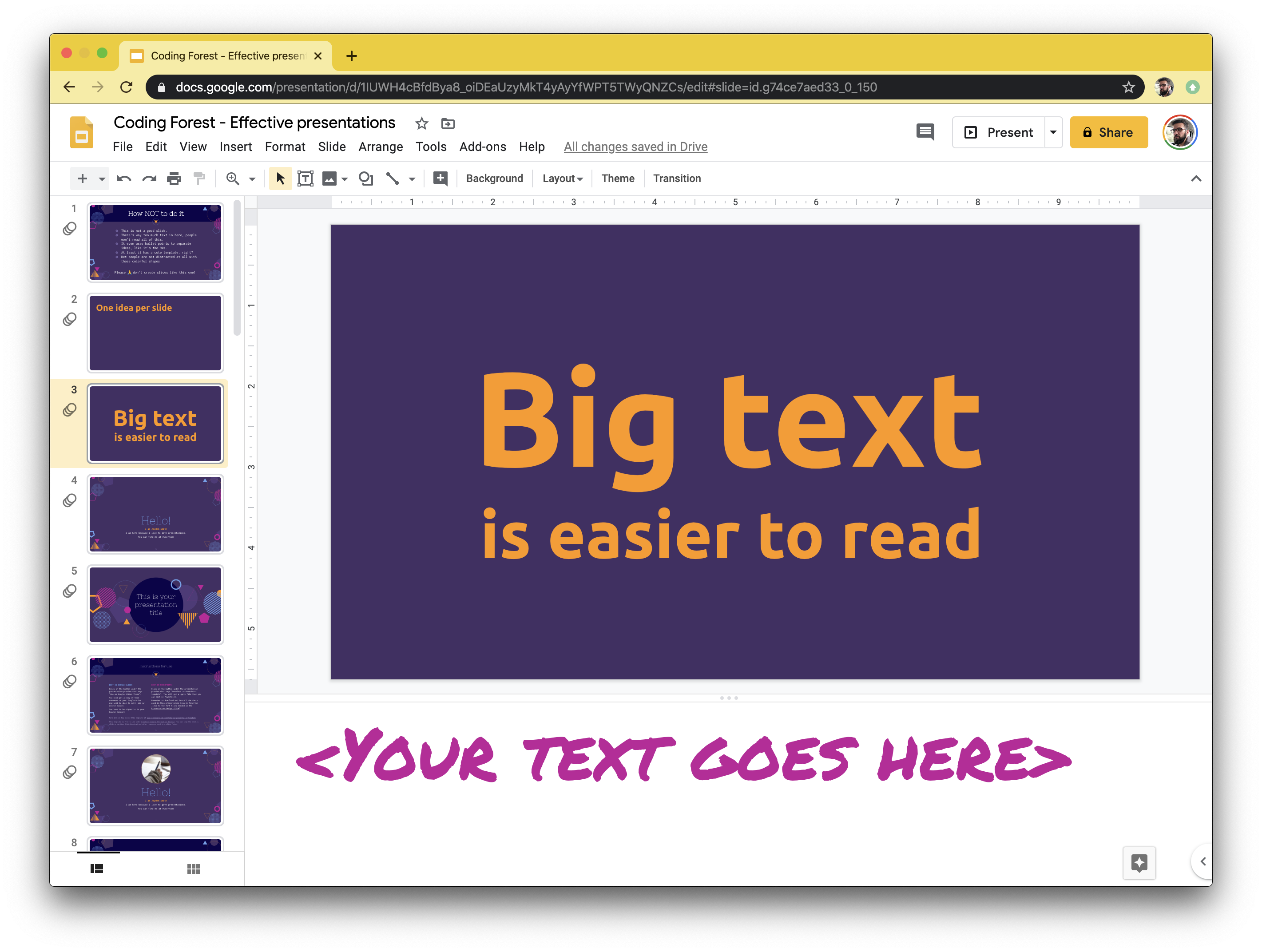
Then, to email your presentation just select Print settings and preview and choose 1 slide with notes. Now you have a PDF handout to send after the presentation that includes all the context needed to understand each slide. As a bonus you also get notes you can use while presenting.
Guiding the audience focus
Now that we have trimmed the fat from the content it’s time to deal with other sources of distraction. Every single thing not contributing to the message is noise and should go.
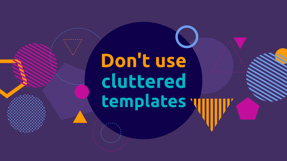
First, avoid cluttered templates. They might look cute on page but they can distract the audience.
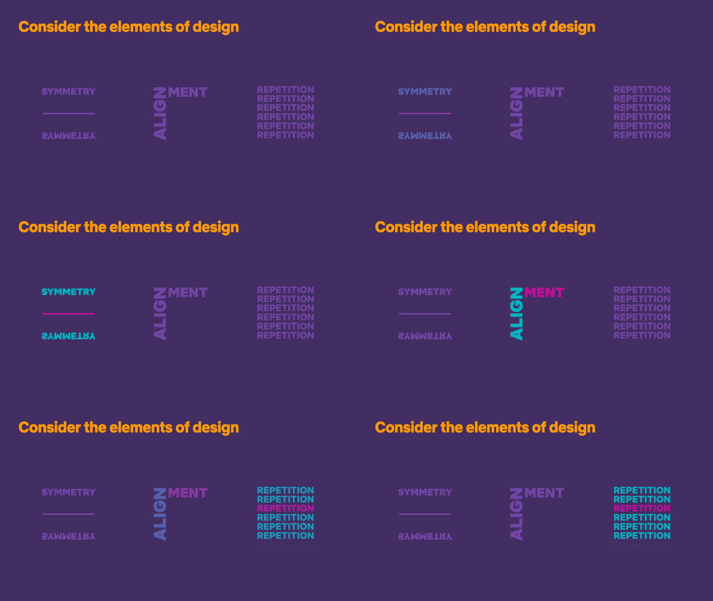
Also, get rid of all the cheese transitions. The only animations you should need is appear and disappear to reveal content as you talk. You can also color and opacity on text or images to guide the audience attention. To achieve this you simply duplicate the slide and apply the appropriate changes.
The only exception to the “no animation rule” is if your animation is needed to express the slide’s idea. For example, you might animate a pointer to represent the order of execution on a snippet of code, as I did here:
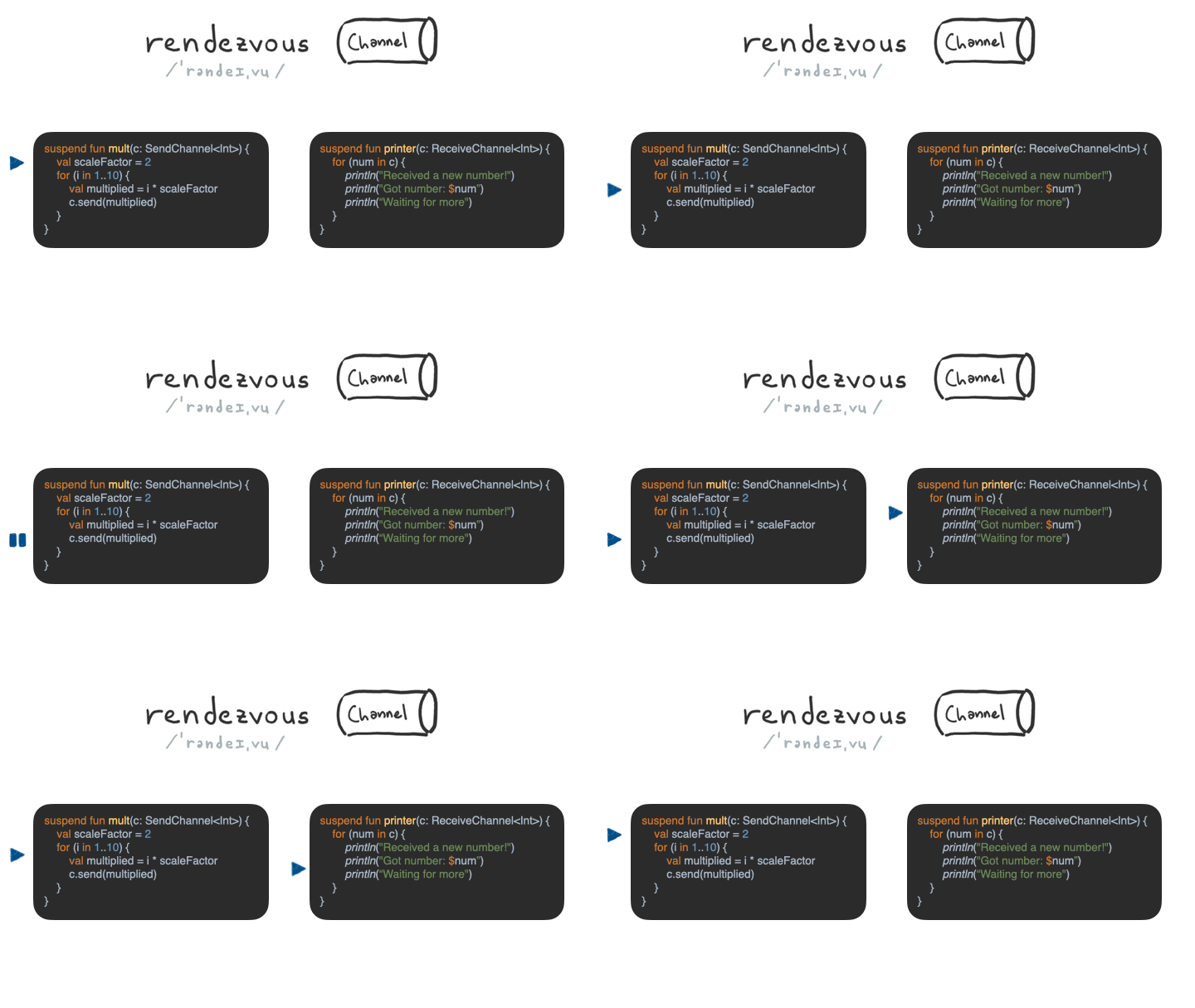
(I used Magic Move on Keynote to create this)
The same rule applies to all other elements of your slide: layout, image size and placement, color, etc. People will infer meaning from all these things, so make sure they’re reinforcing your message and not working against it. For example if you’re talking about three things that happened one after the other align them horizontally and sort them left to right. If you mention a big number make the text big. If you’re comparing two similar things make them the same size and place them side by side. Note how in the “elements of design” slide shown above, the text placement emphasizes the words’ meaning.
Finally, if you have gifs on you presentation, make sure to stop them after one or two repetitions. Anything, blinking or moving on the screen is competing with you for attention. https://davidwalsh.name/prevent-gif-loop
Start with a hook
Humans think in stories, and we try to make sense of the world by telling stories. Yuval Noah Harari
You know how most presentations start with: “My name is Juan and I’m professional turtle trainer, today I’ll talk about depression in turtles“? People already showed up, so they either know who you are or care about the topic you’ll be presenting about, or both. So instead of opening with a boring introduction try using a hook.
Review Start your presentation with a story, a joke or an anecdote related to the topic. Grab the attention of the audience from your first line. Once they’re hooked in and paying attention you can introduce yourself. You see this all the time on TED talks like this one:
Repeat, Repeat, Repeat
If you want your message to stick say it multiple times. The trick to avoid boring your audience is to say the same thing in many different ways. Paraphrase, use an image, present an example or a counter-example, make a rethorical question, use a conversational style… Get creative!
This works because different people prefer different styles of communication. Some of us are more visually inclined, some like specific examples over generalizations, etc. Also, by repeating the mains ideas you’re signaling the audience what’s important. You’re separating the wheat from the chaff. Last but not least, it also works because people get distracted and they might have missed the point the first time.
When possible try to evoke some emotion. As the Head First Series taught us: “brains are tuned to pay attention to the biochemistry of emotions”. Share a personal anecdote, make them laugh with a joke or pique their curiosity with a controversial claim and you can guarantee they’ll be paying attention.
The slides
Let’s go over some of the most common types of slides and how to improve them.
The title slide
Most of the time the title slide includes just the title of the talk. Instead, consider providing some context on what’s going to be covered in the presentation as a full sentence. If you’re opening with a hook you can have visuals on your title slide to get right into it.

The intro slide
Consider using a blank screen for your introduction. This way you guarantee the attention will be on you and not your slides. Another option is to use a personal photo, related to the topic at hand. Either way, remember that it’s best to open with a hook instead of your introduction.
The agenda slide
Most of the time you don’t really need an agenda slide. Just jump straight to the content. But if you do include one, make sure you use a small number of sections. Three or four is the sweet spot. You can use images and colors as visual representation of each section.
The quote slide
You should have the quote on your slide, only if you’re going to read it word by word. If what you’re saying doesn’t match the text on the screen people will get confused. Another option is to simply blank the screen while reading the quote (here you get to paraphrase if you want).
The image slide
When using images go big. Don’t worry about breaking the template if you’re using one. Take an empty slide and set the image as background. Don’t put text on it unless you really need to. And if you do use contrasting colors, or place the text over a box with a transparent background to make it readable.

The code slide
Make sure to use syntax highlighting to make the code more readable. Copy and paste from your favorite IDE or use an online syntax highlighting tool to get a color palette that works with your background.
Remove all boilerplate. If it’s obvious it can be omitted. For example, if you’re showing a Java class remove all getters, setters and constructors. Don’t worry if the code on the slide doesn’t really compile. You can include the actual code in the handout or link to a public repo or gist.
If the code has multiple parts you’ll be talking about, highlight only the section you’re focusing on and gray out all the rest.
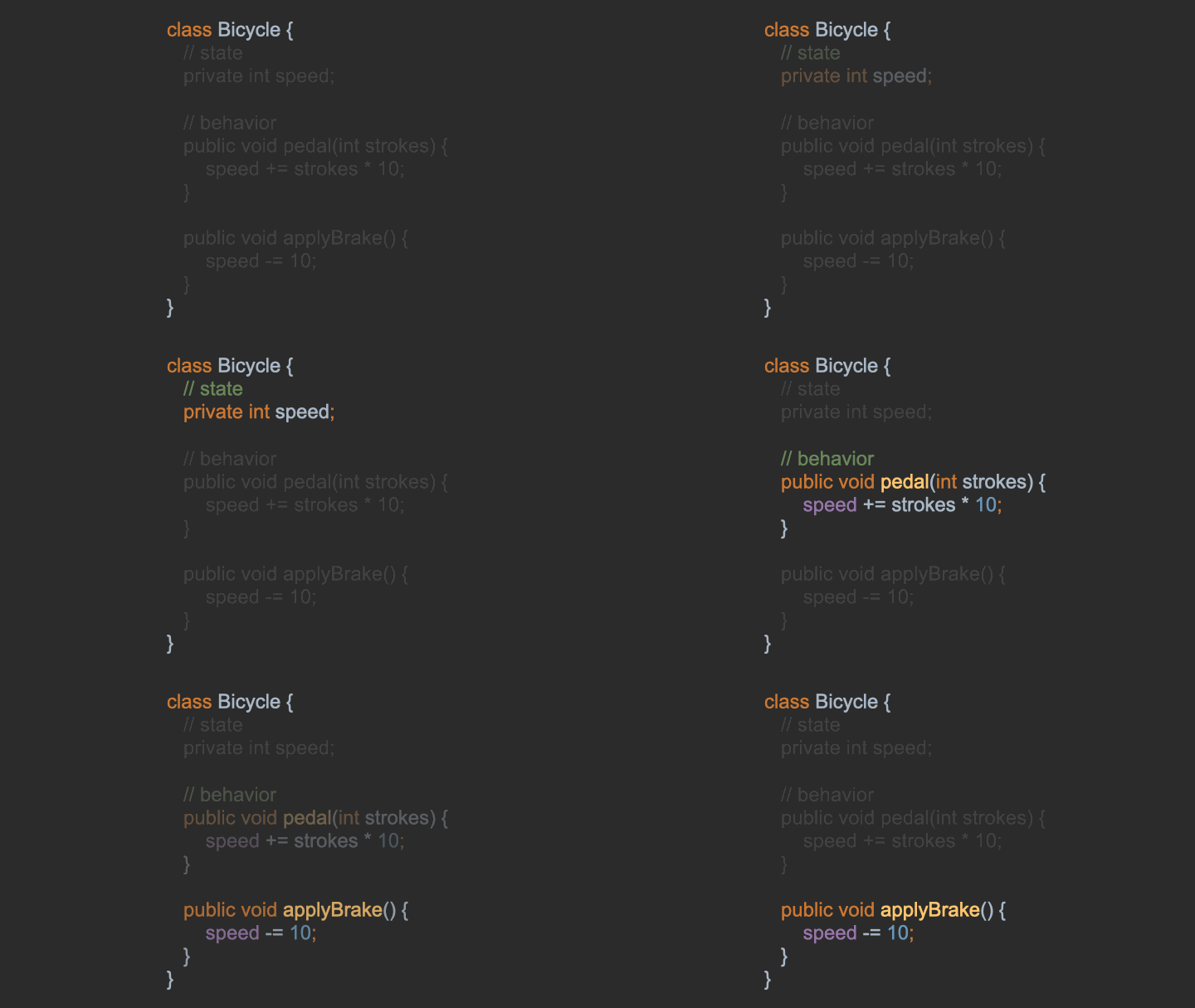
Consider using pseudo code so people don’t need to be familiar with your language of choice to understand the slide.
Finally, if you like living on the edge and want to do live coding on the stage, you can open your code in full screen on a different workspace and have a separator slide to transition to the editor. Some IDEs have a presentation mode you can use to make the font huge and remove all other distractions. Just make sure to have a plan B because demos always fail.
The “Thank You” slide
Many times this is the slide that stays on screen for the most time. Don’t just write “Thank you” or “Q & A”. Use it to present a summary of the main ideas on your presentation. Make sure to include your social handles in case somebody from the audience wants to reach out to you.
Bonus: Blanking out the screen
In this article I mention using an empty slide or blanking out the screen for some sections like the introduction or the quote slide. Having nothing on the screen means all eyes are on you. There’s nothing competing for the audience attention. You’ll be surprised with how well this works.
To achieve this you can either user an empty slide with a black background, or use one of the keyboard shortcuts in any part of your presentation.
Acknowledgements
Some of these things I learned from Zach Holman writings (check his website speaking.io). More recently I attended a course from Christine Haas Consulting which really helped me polish my presentation skills. The rest comes from years of watching great presenters and practicing. That’s the only way to improve, right?
